Multi-dimensional Monster and GDP
- Sumeet Pradhan
- Jul 25, 2022
- 7 min read


Richard E. Bellman, the American mathematician, introduced a term called the curse of dimensionality. It mostly alludes to the exponential increase in computational effort and analysis complexity of a system when the number of dimensions involved grow large. We may think that this multi-dimensional monster casts it curse upon the data scientists and statisticians; aam aadmi being spared. Alas, the world we live in and the world we have created is multi-dimensional (not just the spatial dimensions) and, more often, it is too much of a burden to explain this world to general public in terms of multi-dimensional quantification.
But we have a way out of this curse. We mostly reduce down the dimensions of any system to just a single scalar (single number) for general public consumption. To explain as complex and multi-faceted system as climate change, we mostly use the scalar value called global average temperature. To explain the knowledge earned by a student over years of school and college, we reduce down all her knowledge to some percentage mark in a board examination or some JEE rank. This simplification makes the life easier but sacrifices a lot of information to achieve that. Many of subtleties are lost and occasionally can lead common man to misleading and wrong interpretations.
One such dimension reducing scalar is GDP of a country. It reduces all the complexity of the monstrous system called economy of a country to a single number and, in the process, masks certain information while creating few misconceptions for common man. To make it somewhat less misleading, another concept called PPP (Purchasing Power Parity) has been introduced. I feel this PPP normalized GDP has created more misconceptions rather than resolving the existing ones. PPP, in layman term, is the scaling factor for different cost of living in different countries. If it is cheaper to live a particular country, then higher its PPP. Broadly speaking, to calculate PPP, United States is taken a base country and prices of the commodities in concerned country are compared to that in US and the ratio is taken as PPP ratio. If it takes x rupee to buy say 1 litre of milk in US and one rupee in India, then PPP ratio of India is x.
But things are not that simple. All goods and services need not have the same ratio of x. Same product may not be available in both the countries. The quality may differ. People may not buy the same set of products in both the countries. And so on. To overcome these limitations, an idealized average consumer basket of the country is imagined and the prices are mapped approximately to “equivalent” basket in US. One can imagine how much of information is lost in this process of dimensional reduction. Simplification has a price.
In current Indian context, the PPP ratio is about 3.0 (3.22 to be precise in 2021). A lot of misinformation goes around exploiting this relatively high PPP ratio. Our FM boasts that, in terms of PPP, India is already the 3rd largest economy behind US and China. Some random Linkedin post (with thousands of likes) claims that this higher PPP ratio is because of Indian frugal mentality. Few people think that goods and services are cheaper in India (which is not same as “living is cheaper”). While some Whatsapp forward claims that effective dollar conversion price is 80/3 rather than 80.
The best way to make sense of this PPP ratio to understand the worldwide PPP ratio data and how India is positioned in global settings. Below is a plot (Figure 1) of PPP ratio of different countries against their respective nominal per capita GDP (i.e., not corrected for PPP). The GDP axis is in log scale whereas the size of each bubble is indicative of population size of that country. Data from three different calendar years (1990, 2010, 2020) are plotted. All data used in this post are from World Bank Open Data | Data, except for the last plot. The PPP ratio has a decreasing trend with respect to nominal per capita GDP especially when the nominal per capita GDP is in log scale.

Figure 1
What can be inferred from this plot? The obvious observation from the plot is that the richer a country becomes, PPP ratio more or less converges to one. To explain this, this post makes an assertion here which few people may not agree. Humans on average, irrespective of their country and culture, have similar instincts and tendencies. In a globalized connected world, given same amount of money in pocket, they will tend to aspire to similar material gains across the globe. Only thing that limits their consumer basket is the availability of money. This has hardly anything to do with frugal mentality or culture. Poorer a country, lesser products in the basket which gives an impression that the country is "cheaper". India in 2020 is no different and lies almost on the mean trendline. One would expect the PPP ratio of India to gradually go down and converge to one (if we ever become a rich economy). Figure 2 shows that the same trend is already observed for China which few decades back had almost similar economy size to that of India. Over last 3-4 decades, PPP ratio of China has evolved in a logarithmic trend consistent with Figure 1. India’s trend too so far is not very different.
Another minor observation of the Figure 1 trend is that there was more scatter in 1990 as compared to 2020. This goes to show that globalization has really picked up in last couple of decades. In 2020, the outliers are mostly the “outcasts” like Iran and Sudan.
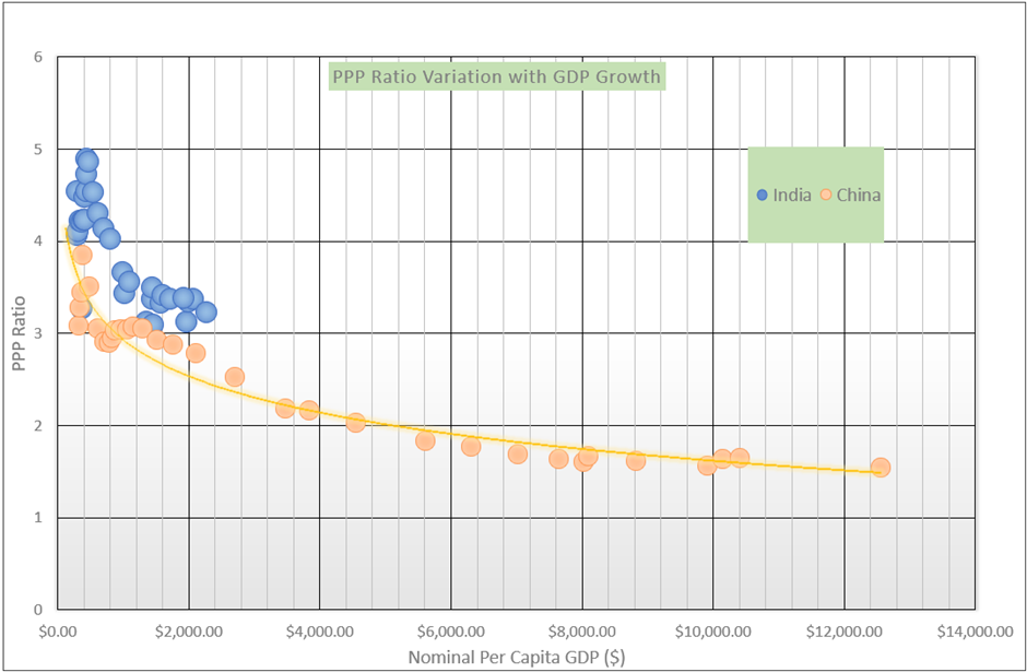
Figure 2
But what about variation of PPP for almost similar nominal per capita GDP? Is it an indicator of that a country is cheap (in a good sense as per economic terminology)? Maybe. It is beyond the scope of this post to breakdown and analyse all the dimensions of the complex monster called economy. Having said that, if we talk about an economy being efficient and cheap, then cheap availability of natural resources and more efficient implementation of human resource would be major factors impacting the “cheapness”. In modern globalized world, given enough wealth to ensure a good HDI, efficient implementation of human resource may not be a significant differentiator for politically stable, connected part of the world. As for abundance of cheap natural resources, especially those in demand, globalization can only strengthen its impact. This hypothesis is well corroborated if we look at the PPP ratio of major oil exporting countries against rest of the world. Figure 3 highlights the oil exporting countries for the PPP ratio scatter plot for calendar year 2020. As expected, the rich oil exporters have higher PPP ratio compared to world average trend. The outlier Guinea only elucidates the fact how Africa has been exploited for past 500 years or so. Political instability in Iraq and Libya is well reflected in their relatively lower PPP ratio. Interesting that Libya in 2010 (just before Arab Spring) also enjoyed a higher ratio but has drastically dropped after that.
Where does it leave India? As of present, we hardly have abundance of any in-demand natural resource that would differentiate us from rest. Even if we are lucky to discover some new natural resource treasure in near future, our humungous population would ensure that the per capita impact of that discovery would not be that significant. The only way forward is following the average trend while ensuring political stability and proper improvement in HDI.

Figure 3
There is another aspect of higher PPP ratio in India. While the efficient and economical nature of Indian goods and services may not hold much water as shown in previous paragraphs, the contrary conjecture that certain aspect of Indian economy is expensive has some truth to it. Compared to US, in India, the PPP ratio for typically low-cost products and skilled services of all kind are usually very high. A laptop or decent sedan (Honda Civic) is almost equally priced in terms of absolute dollar numbers in both US and India. Whereas the cost of atta, rice or samosa is quite less (hence higher PPP). Human services starting from a plumber or daily wage labourer to cab drivers are also on cheaper side. In Figure 4 below, some PPP estimate ratio across different categories (from an upper middle class urban Indian perspective) are plotted and it indicates the same trend. The data used is based on just one or two estimated points and hence the exact numbers used may not be right on the marks but at least some approximate trend can be inferred. One may think as the PPP ratio is well above one for low-cost items, it indicates India is cheaper in these items. But one needs to see the other side. The people behind these low-cost products and services (farmer or daily wage labourer) put the same effort (even higher than their US counterparts due to lack of automation) and yet the get paid less (as their products are cheaper). But when they go to the market to buy relatively higher end products to maintain a respectable standard of life (a motorcycle, a small LED tv or a decent house), they have to pay a higher price (these products are priced almost similar to US market). Hence, from their perspective, a higher PPP ratio for lower end products only mean that their cost of living is expensive.
Any chest thumping based on the PPP numbers can be totally misleading. Next time if you (mostly likely an upper middle class urban Indian) feel that few things are cheaper in India, then also take into consideration that perhaps someone lower down the economic strata is having a more expensive, harder time to make it cheaper for you.

Figure 4
The intent of this post is not to cover all the aspects of the GDP and PPP. In fact, I may not have the required skills to make a detailed assessment of such a complex system. It is just to appreciate that the actual system is far more complex than the couple of numbers used to represent it. Any hasty inference based on the superficial numbers may not be always appropriate.


Quite informative.